Storytelling
Storytelling is core concept in Columns - unlike many visualization tools, Columns doesn't stop at visualization. Beyond that, it enbales users to bring their creativity and maximize its influence.
There are 3 types of storytelling tools available in Columns
- Chart customization
- Visual design
- Presentation craft
Chart customization
In the chapter of visualization, we have showed some examples that make a visual more expressive. Changes like coloring scheme, contrast view, and highlighted value are all good ways to make your visual more vivid.
In progress, we are adding more and more tools built specifically for each chart to give our users more choices to customize them.
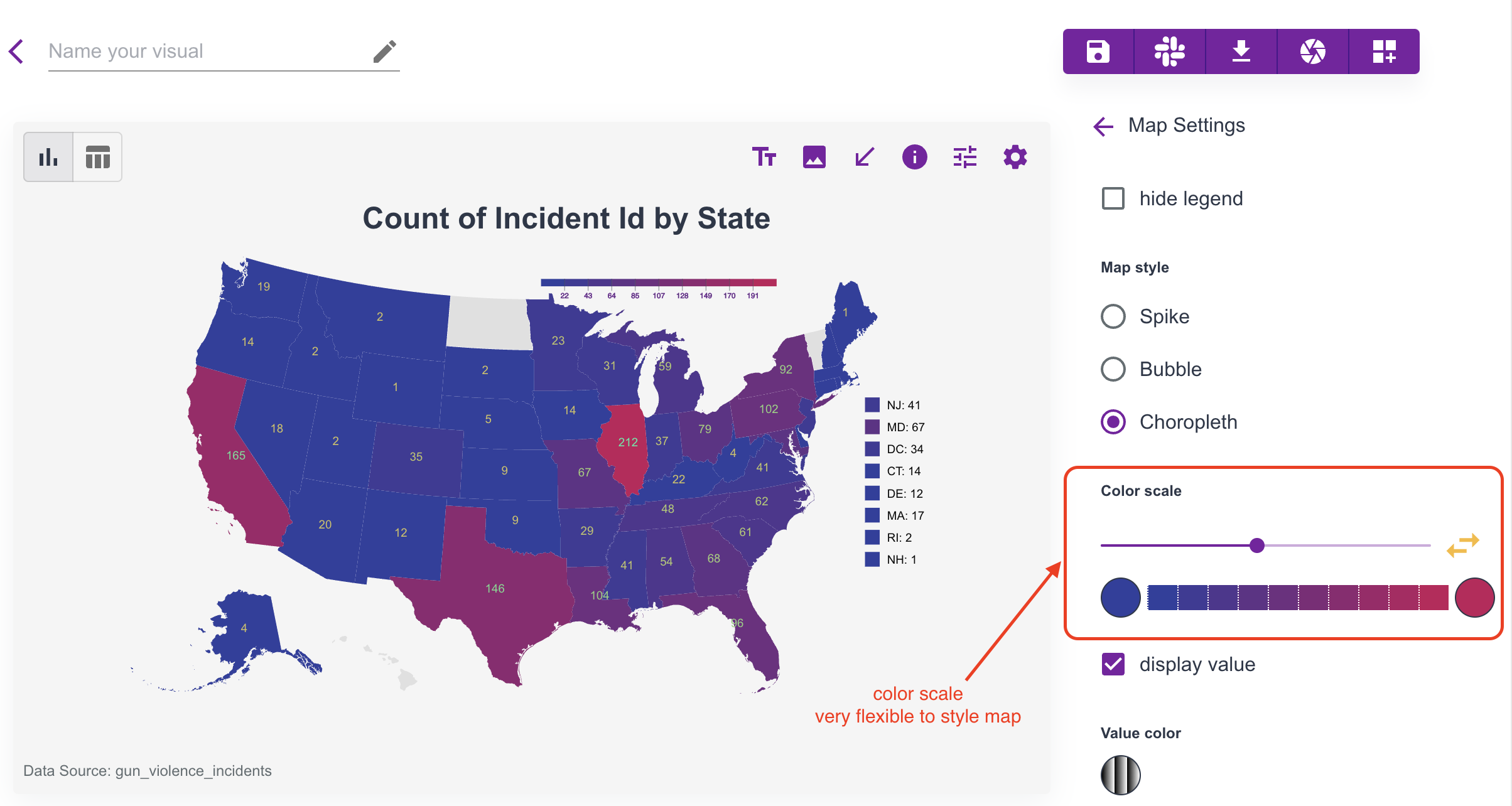
One general suggestion to our users - in every chart, try to click the element from the canvas, there are dynamic settings show up related to the item in click. Here we have a special mention on map chart, especially map type and color scale are often found very useful.

Visual design
Like other visual design tools, Columns offers a basic but well-designed toolset to help tell a story. This includes annotation, images, icons, arrows and shapes, and many more are under development.
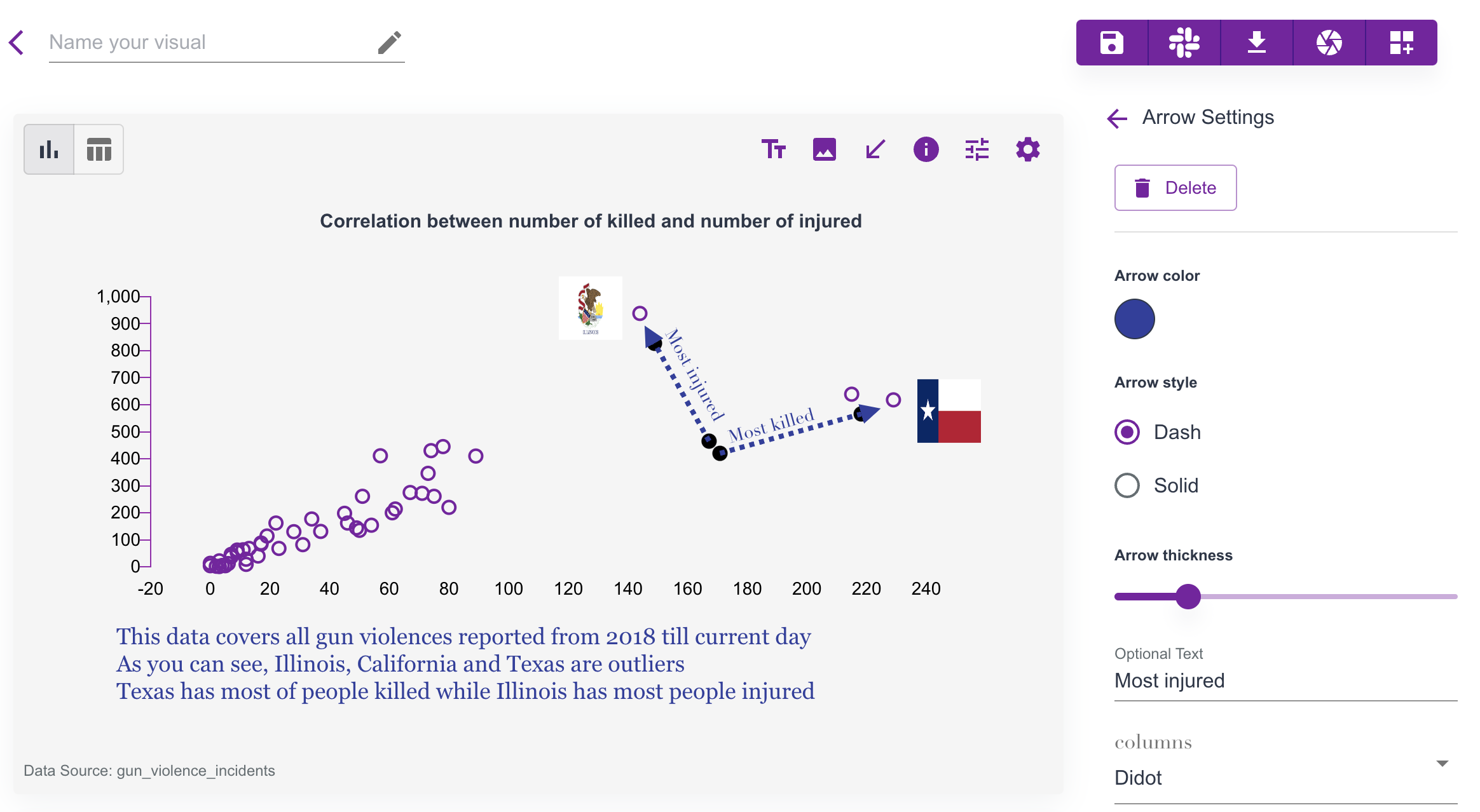
Let's use an example to show how those visual elements help make the story more attractive for readers.
 In this example, we have used
- Adjusted side spaces for its scatter chart.
- Multi-lines of text annotation under the chart.
- Images of two highlighted states: Illinois and Texas.
- Arrows with explainable text for these two states.
- Updated visual title.
- Other color styles.
Customization
Columns presents a canvas to you, on the canvas, you can (nearly) customize every single element.
If not sure how, just hover your mouse and click the element, an dynamic settings will show up for it.
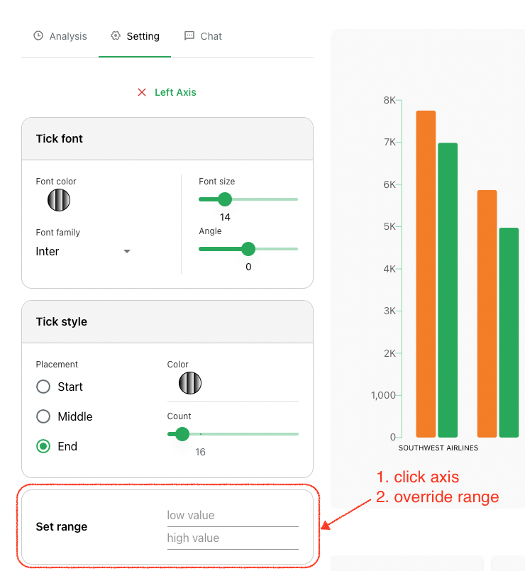
For example, here is a way to customize Value Range for an axis in a chart, just click the AXIS, and set it.

Remeber: (nearly) every visual element on the canvas can be customized, please play around to discover options.