Scatter
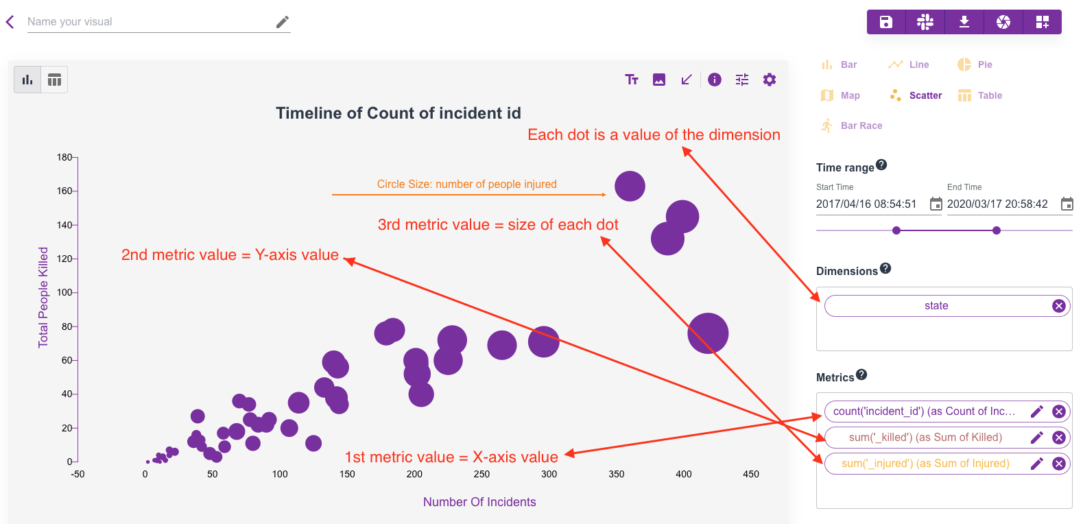
Scatter plot is to describe correlation between one metric and another. Sometimes, people also look for Bubble graph which is usually supported by this scatter chart type.
As a side note: we have bubble type for Map chart as well, check that out when you want to plot bubbles in a map.
In a scatter plot, you can have maximum 4 metrics, and the order of these 4 metrics matters:
- The 1st metric will be used as X-axis value.
- The 2nd metric will be used as Y-axis value.
- The 3rd metric is optional, if provided, it will be used as size of the bubble mapping X and Y.
- The 4th metric is optional, if provided, it will be used as the color of the bubble mapping X and Y.
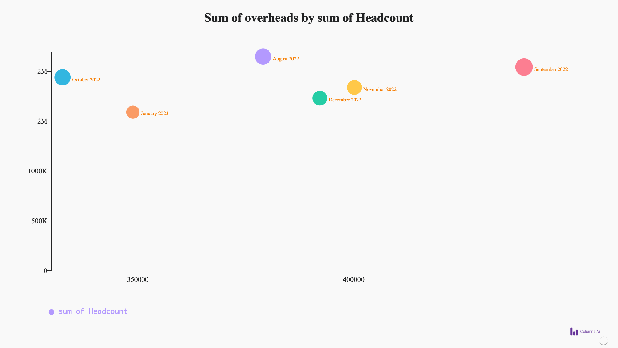
Here is a latest example:
Scatter Anatomy
This is an old graph, but the concept illustrated here is correct: