Source: Unsplash
A Guide for Non-Technical Users
Analyzing data is no longer just for the data team. When more people are able to analyze data within an organization, the business generally performs better. Normally, businesses perform better when more individuals can analyze data within it. Specifically, in a recent study conducted by Harvard Business Review, 87% of respondents said that their companies would be more effective if they gave their front-line workers more power with numbers.
But uncovering insights is only the beginning. The actual value comes when these findings are turned into an interesting story that motivates action and brings about tangible change. This guide will cover all the basics necessary for creating data-based narratives that are both convincing and suitable for non-technical users.
Understanding Data Storytelling
Data storytelling is the art of combining facts and figures with narrative techniques in order to communicate important information. It consists of three essential parts, namely data, story and visuals.
Components:
- Data: The factual backbone of your story.
- Narrative: The structured progression that guides your audience through the data.
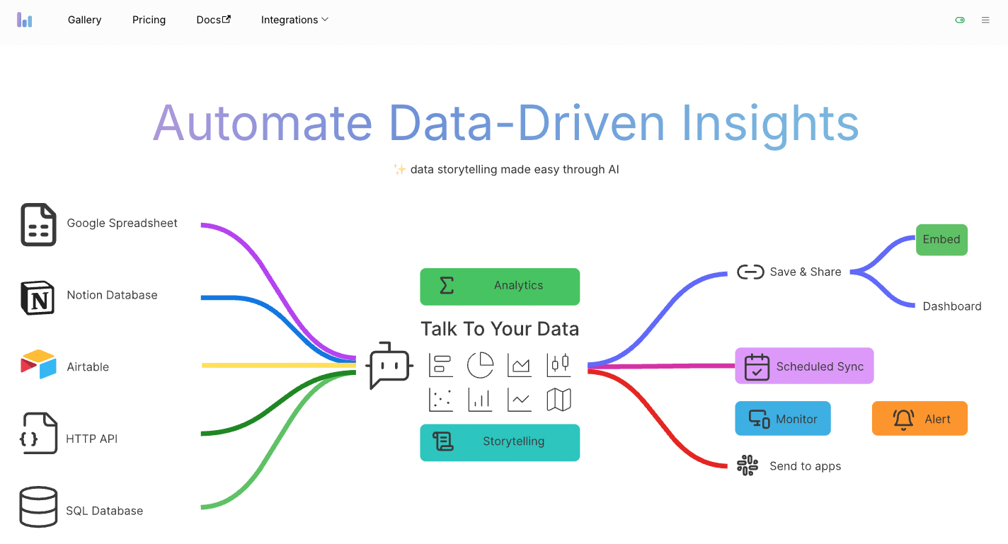
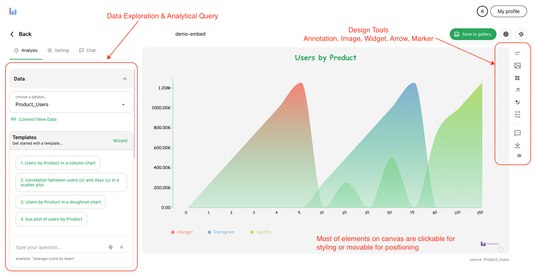
- Visuals: Graphs using Airtable connection, charts, and images that illustrate your data and enhance comprehension.
The power of data storytelling cannot be underestimated. According to research from Stanford University, people are 22 times more likely to remember information if it’s presented in the form of a story. This method makes your data not only easier to understand but also harder to forget.
Identifying the Right Data
Before you start telling a story, make sure that you have all the necessary information. Find out what exactly you want to achieve and who your target audience is. Also, find reliable sources of data and determine their relevance for the given context.
Purpose and Audience:
Determine the objective of your story. Do you wish to educate, entertain, or convince? According to a Forbes article, 93% of business leaders and data professionals agree that successful data storytelling can boost revenue. Additionally, 92% of them believe that data storytelling is an effective method for communicating data and analytics results.
The most important thing here is knowing what people understand well based on their needs; this will help in developing a message that can resonate with them, thus making storytelling effective.
Finding Data:
When conducting thorough research, it is critical to consult a variety of credible sources that provide comprehensive information. Whether you're looking for academic publications or specific industry data, using the right databases can make a big difference.
For those interested in specialized fields like library and information science, looking for resources like Research.com online MLIS programs can help them find advanced learning opportunities. These programs not only provide extensive knowledge in managing digital and physical information, but they also offer the convenience of online learning.
When gathering facts for a narrative, it is critical to use reliable sources. Government databases such as the Census Bureau, industry reports such as McKinsey, and academic journals, among others, can serve as useful examples in this case. Some websites, such as Data.gov, may be useful for finding relevant materials through searches, whereas Google Scholar provides access to scholarly publications worldwide during the research process if you want to learn more about online MLIS programs. Using these sources ensures that you have accurate, up-to-date data to support your research and educational objectives.
Evaluating Data:
All data aren’t made the same. Evaluate all of your sources for dependability, truthfulness, and relevance. Check the date of publication to be sure the data is current and understand the methodology used to acquire it.
Structuring Your Narrative
A compelling data story has a clear structure. Just like any good story, it should have a beginning, middle, and end.
Story Arc:
- Beginning: Introduce the context and the main question or problem.
- Middle: Present the data, providing insights and explanations.
- End: Conclude with the implications of the data and a call to action.
Building the Framework:
Frame your data within this structure to create a cohesive and logical flow. Start by posing a question or highlighting a problem. Use your data to explore the answers and conclude by summarizing your findings and suggesting the next steps.
Creating a Flow:
Ensure that your narrative moves logically from one point to another. Use transitional phrases to help guide readers along and avoid jargon that may confuse those without technical knowledge.
Using Visuals to Enhance the Story
Data storytelling relies on visualization. It helps people understand complex numbers by presenting them in digestible formats – and, more importantly, keeps them interested.
Types of Visuals:
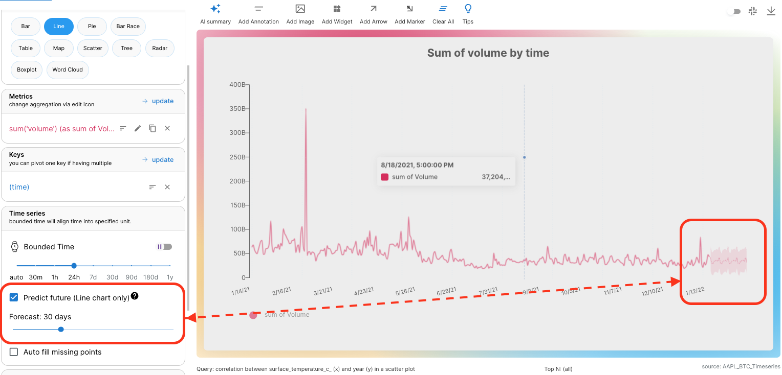
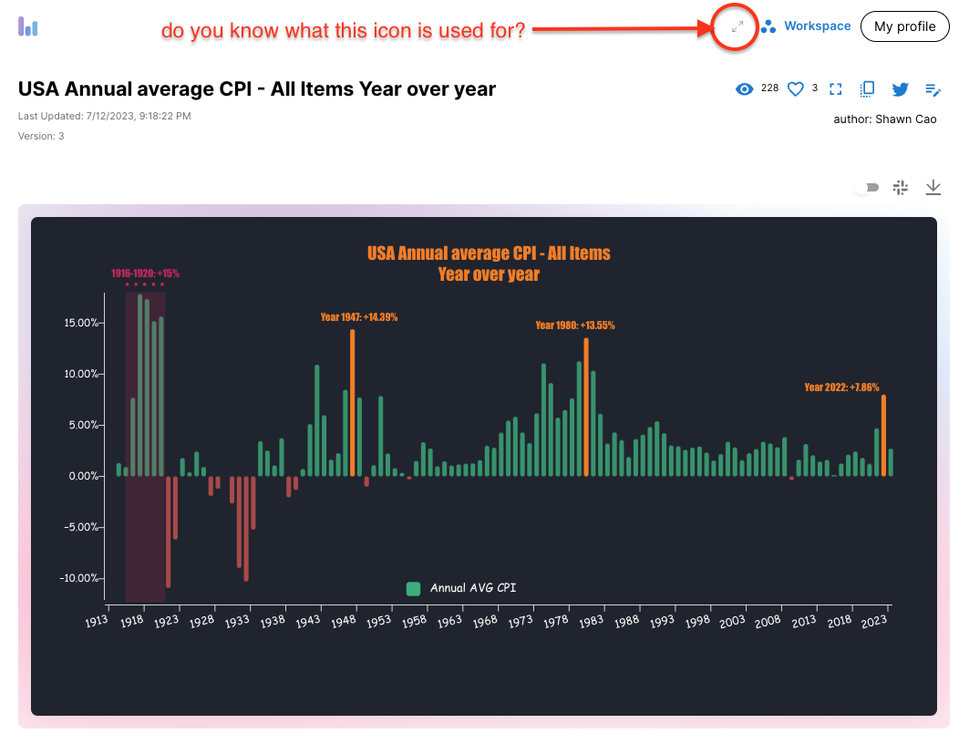
- Charts, Columns, and Graphs: Use AI design on columns, bar charts, line graphs, and pie charts to represent quantitative data.
- Infographics: Combine text and visuals to present data in a visually appealing way.
- Maps: Geographical data can be effectively represented with maps.
Choosing the Right Visual:
Select visuals that best represent your data. For instance, use a line graph to show trends over time or a pie chart to display parts of a whole. Avoid clutter and keep your visuals simple and to the point.
Design Principles:
Apply basic design principles to create clear and engaging visuals:
- Simplicity: Avoid unnecessary elements that distract from the main message.
- Consistency: Use consistent colors, fonts, and styles.
- Emphasis: Highlight key data points to draw attention.
Making the Data Relatable
Data alone can be dry and impersonal. Make it relatable by including a human element, providing context, or playing with emotions.
Human Element:
Include stories or examples that illustrate how the data affects real people. This helps your audience connect with the data on a personal level.
Contextualization:
Give some background so people know why this information is relevant to them. Explain what’s at stake or how it connects with their lives.
Emotional Engagement:
Use techniques to evoke emotions. For example, share a success story backed by data to inspire your audience or highlight a problem to spur them into action.
You don't need to be a data scientist to create compelling data stories. There are plenty of AI storyteller in tools available today designed for users at any level of expertise.
- Tableau: A powerful data visualization tool that's easy to use.
- Canva: Ideal for creating visually appealing infographics.
- Google Data Studio: A free tool for creating customizable reports and dashboards.
Learning Resources:
- Online Courses: Platforms like Coursera and Udemy offer courses on data visualization and storytelling.
- Tutorials: Websites like DataCamp provide interactive tutorials.
- Books: "Storytelling with Data" by Cole Nussbaumer Knaflic is a great resource.
Common Pitfalls and How to Avoid Them
Even the best storytellers can make mistakes. Here are some common pitfalls and tips to avoid them.
Misleading Visuals:
Be careful not to create misleading visuals. Ensure your charts accurately represent the data without distortion. For example, avoid truncated y-axes that can exaggerate trends.
Overcomplication:
Keep your narrative simple and focused. Too much information can overwhelm your audience. Stick to the key points and avoid unnecessary details.
Data Overload:
Presenting too much data at once can be confusing. So, focus on the most significant information and present them in small pieces. Use summaries and highlights to underscore important points.
Real-World Examples
Seeing how others have successfully used data storytelling can be inspiring and educational.
Case Studies:
- New York Times: Their interactive data visualizations and stories during the COVID-19 pandemic effectively communicated complex data to the public.
- Spotify Wrapped: Spotify's annual recap uses user data to create personalized stories, making data relatable and engaging.
- Gapminder: Hans Rosling's use of animated bubble charts in his TED Talks transformed dry statistics into captivating stories.
Analysis:
These examples are effective because they:
- Present data in an engaging and accessible format.
- Use narratives to provide context and meaning.
- Employ visuals that enhance understanding without overwhelming.
Transform Insights into Action with Data Storytelling
 Source: Unsplash
Data storytelling is a powerful skill that can change the way we communicate with each other. Understanding more about data storytelling, choosing the right data, structuring your narrative well, utilizing visuals effectively, making data relatable, using user-friendly tools for this purpose as well and avoiding common mistakes while doing so will enable you to make stories that inform, persuade, and entertain your audience.
Are you ready to start your adventure with data storytelling? Begin playing around with some of these methods or techniques outlined in this article and see how impactful can be in creating compelling narratives from numbers alone.