13 posts tagged with "columns"

View All Tags

· 3 min read
Shawn Cao

Preface

Color Season

The rain has been pouring here for a few days, for Seattle, it means the beginning of the fall. I love Fall, it's the season of colors. In the morning, I feel so content walking with my daughter, on the soft yellow leaves toward the school, before the bell. That's even better if holding a warm cup of coffee, on the other hand.

I keep working on Columns because I want people to find the same beauty in their data.

Alright, here are our updates for September -

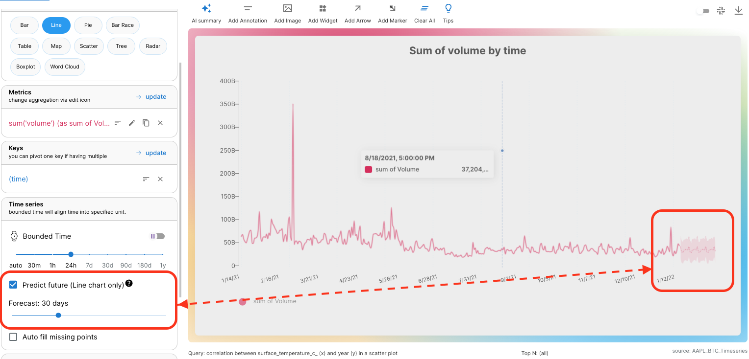
Easy to Forecast

Time series data is the special power of Columns because it's built on top of a super-fast time-series database.

When you connect your data, if supported TIME fields are detected, you can choose one as the time column, check out this doc for supported time values.

As long as your data has a Time column, the Time Range filter will always show up. In addition, there is a special KEY called (time) you can select to represent the time column, meaning all metrics selected will be broken down by TIME. Accordingly, Time Series pane will show up for you to:

  • Adjust time window
  • Choose the time window type (bounded vs. unbounded)
  • Predict future.

Connect a time series data set today, and see how the forecast tells the future of your data! Forecast Example
Consolidated Explore

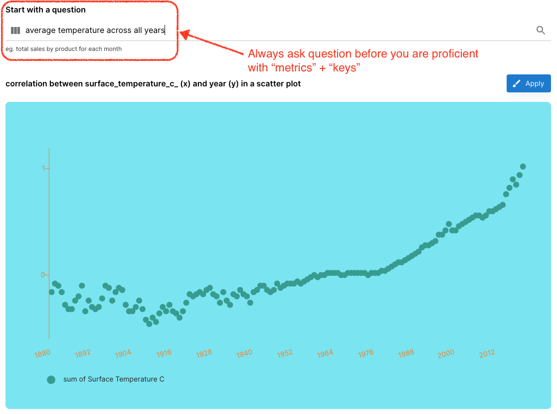
Columns is NOT a simple charting tool, it's designed to analyze your data, the two most important terms in the analysis are

  1. "Metrics": the value you would like to see
  2. "Keys": the dimensions you would like to break down the "metrics".

For example, in a query of "average temperature across all years" or "average temperature by years", "temperature" is the Metric, and "year" is the key.

When you get lost, always go to "Explore", simply type your question and AI understands you and translates your question into the query.

In this consolidated view, we also integrated Data Summary below query generation, so you can simply scroll down to view your data stats, data samples, each value distribution for each field, etc.
Explore Example

Edit Preference Inline

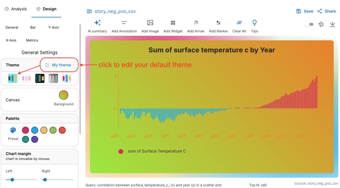
Preference is the collection of properties that defines your preferred styles: background, palette, logo, font, axis color, etc.

Before you had to go to your Profile page to view and edit those properties, now you can edit them in story building time, any time you want to modify, you can just open and edit.
Preference Example

Window Sizer

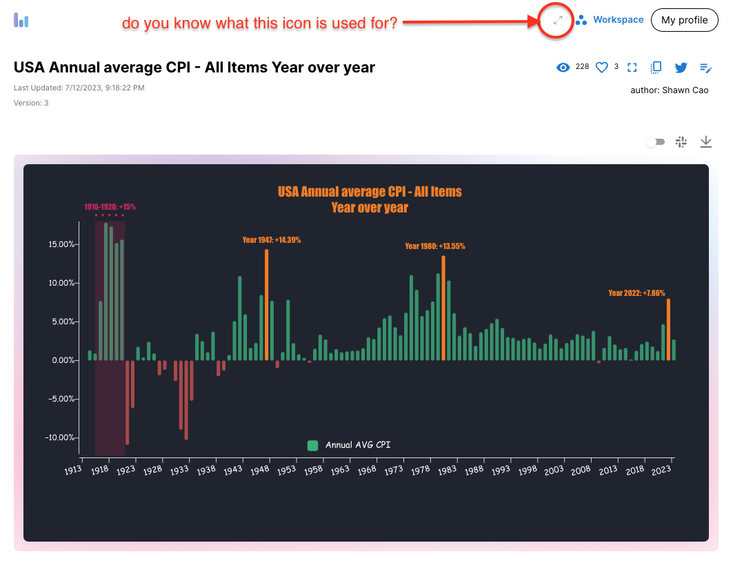
The last shortcut to mention - switch window size between standard vs wide. I usually switch to "Standard" when viewing a data story, but use "Wide" in creating time.
Window Size Example

That's all for now, see you next time!

· One min read
Shawn Cao

Airtable connection

Airtable is used by many people, and we are excited to announce that Columns now supports Airtable connection. Just simply connect your Airtable, and choose any table to be analyzed and visualized in Columns.

Build beautiful and insightful graphs with your Airtable data, and share with your team or the world. You can also set a schedule to keep it up with your Airtable data.

Check out the example demo we put on the homepage: [https://columns.ai/airtable](Columns + Airtable)

Other updates

  • 🥇 Columns now support the Notion Relation field in data analysis, nearly no other tools support it due to the graph traverse complexity.
  • 💕 Columns now support you to customize your visual sharing page with your own LOGO and other tweaks.
  • 🎗️Columns now support you to select multiple versions of your visual story and share it or embed it as a Slideshow.
  • 🔐 Columns now support you to only allow a shared story to be embedded in a specified domain whitelist for security.

Columns LTD

We are offering Columns LTD currently, grab a lifetime access to Columns Premium now before the deal is gone.

· 2 min read
Shawn Cao

The AI storyteller

As we are planning Columns 2.0, we have fully embraced AI to help you tell a better story with your data. We are excited to share with you the first demo where Columns acts as a storyteller.

User experience updates

We continiously hear from our users and made improvement upon their feedbacks.

Here are some of the updates we made recently:

  1. Better navigation: like we have put My Workspace on all the places possible for signed users to access their workspace. Anything important that could be made inline, we have tuned them too: timeline settings, graph theme, data console, query history, etc.
  2. Query builder: we have made it more intuitive to access the query builder from the Analysis tab directly.
  3. Graph tools: we have made it easier to access the graph tools by moving them to the top, also we have added label to them for easily understand what they do.
  4. AI questions: Upon a dataset connection, we have enabled AI generated questions to your data so that you can easily discover insights from your data.
  5. Screen Width: we introduced screen width options (standard, wide) for you to choose from, so that you can easily switch to fit different device for better view. You can access these options on from your profile drown down menu.

· 2 min read
Shawn Cao

The full loop with Notion

You may have tried Columns Notion integration Notion Integration to analyze and visualize your Notion database, but do you know what the full loop with Notion is?

It means, once you bridge Notion database with Columns, you can leverage a few functions to keep data and graph in sync with 0 effort. Let's dive into the details.

Notion Columns Loop

1. Connect Notion

Each Notion database can be connected as a live link on Columns, you can manage them in your 'workspace/data' page.

2. Build story

You build a story on Columns using the previous connection, save the story to your workspace. You manage all your stories in your 'workspace/story' page.

3. Embed story

By sharing a story with one email or make it public, you can easily grab its view link, embed url and embed code, all depends on what you want to do with the story. Grabe the embed url, find a notion page you want to embed the story, paste the url into the page, and you will see the story is embedded into the page.

4. Auto-update

Every story offers schedule settings, you can set a schedule to ask Columns to auto-update your story, so that the story will always be up-to-date with your notion database. Any changes you made in your notion database will be reflected in your story.

Summary: the full loop

Congrats! Now you know how to build a full loop with Notion in 4 simple steps, you can build a story on Columns, embed it back to your notion page, and set a schedule to auto-update the story, so that you can always have a live story on your notion page. You just edit your notion database, and Columns will take care of the rest.

Does that sound great? Let us know if you have any feedback or questions, we're here to help.

· 3 min read
Shawn Cao

Columns Update April 2023

April has been great so far for Columns and our users, people find it more and more enjoyable at data storytelling, from insights discovery, and chart building, to presentation beautification.

At the beginning of the month, we announced Notion Integration where you can easily build two-way sync between your Notion database and Columns graphs. Today, I’d love to share some more exciting features that simplify your storytelling process further.

AI Design

On Columns, AI is used to help us with two main scenarios for easy data storytelling: Insights Discovery and Story Design.

Today, we focus on the second part, let AI design a beautiful and insightful presentation for you. This includes 3 initial functions we brought to the Columns editor

  • Magic Theme: in addition to the built-in theme template, now we can ask AI to generate a customized theme for your specific story with a “topic” for styling, it generates background, colors, and palette to have a nice and comfortable look and feel.
  • Smart Title: a smart title is generated based on your insights data.
  • Insight Summary: a summary of your insights, AI will talk about your data and chart, I personally find the summary is a must to have for most storytelling.

These features free us from learning so many different settings to beautify a story, as time goes on, we will keep improving them based on your feedback, as we hope Columns will be your true co-pilot for data storytelling. Check them out and share your feedback!

Check out the demo on Youtube to see how these features play: AI Design on Columns.

Team Domain

For users who have a team plan on Columns, this is a step further for team customization and white labeling. On your team page, you can find your own sub-domain on Columns, you can set up your own domain to host all your stories. We will enable your own LOGO and styles in the near future, but please let us know what matters to you.

Open-sourced Graph API

We have open-sourced our core graph model, so if you are a developer, or you have an IT team, now you can access, build and host all your data stories in a programming interface, all through a simple API with an API key obtained from your Columns profile.

Check out this open-source project started from the Columns API landing page.

Graph/Chart Features

Last but not least, we keep improving Columns user experiences, to list a few that were added in April below, you may want to sign in to Columns and play with it to discover more updates lively:

  • Axis ticks line hide/show.
  • The trend line on Bar/Column chart.
  • Easier navigation between “item” settings.
  • Social preview of a visual story when sharing on social networks, eg. Twitter, and Facebook.

Thank you for being with Columns so far, many great things happen in Columns day by day, and we’re glad to have you ride with us. As we put the full force investing on AI, we wish Columns AI to be the ultimate place for you to build and share your data stories.

Let’s make Columns to be “Your co-pilot for data storytelling.”.

· 5 min read
Shawn Cao

Embed a live data story in your blog

As a blog writer, do you dream about embedding a live data graph in your article? It shines your content to be more attractive and makes it much more digestible for your readers, also it makes it more worthwhile for your readers to share with others.

More importantly, what about if the data graph automatically updated, and you don't do anything to get the magic?

For example, current blog embeds a live interactive graph, as shown below (hover mouse over for tooltip):

If this is interesting, please read on…

By the way, prefer watching a video? This video is an explainer of this blog post!


Today, let’s lay out the process of how you can achieve this easily using Columns, you can also follow the 5 simple steps to practice it right away...

Step-1: Find relevant data

Believe it or not, there are tons of data out there await to be analyzed and visualized. When you write about a topic, you need some data points to support it, you either can search open public data or manually create your own data. Public data can usually be found in government departments or various organizations. Data is usually available for download as CSV files.

No matter whether you get data from external sources or manually input it on your own, putting them in a Google Spreadsheet is the best way to have your scenario fully automated.

Step-2: Organize/format data

To get live data to be analyzed as a live graph, you need to keep it as a clean table, a clean table has its first row containing all the column names, and each column has either a text value or number value.

As demo, the data for the above live graph can be found here: Product-Users-Days. From the table, you can see it has each column is named and consistent format of values for each column. Keep it as raw as it is, you don’t need to do any analysis at all, since data analysis and summarization is the job to be done by Columns later.

Step-3: Connect data & Build graph

Connecting a google spreadsheet is very straightforward, you just need to paste your spreadsheet URL or copy its unique ID, and follow the 2 steps connection wizard. Your live connection shall be established on Columns from which you can generate as many beautiful graphs as you want. A simple doc describing the Google Spreadsheet connection can be found here.

Once a data connection is created, you can find it in the data tab of your workspace.

Just to mention, Columns don’t store or copy your data, a live connection is only used to read your data when it needs to be.

Now, it’s time to build something visually. Just open a new visual creator, and start by choosing the data connection we just created. Upon data selection, Columns loads it in our cloud computing cluster, making it ready for a super fast exploration.

A few things to get you started:

  1. Inspect Data: get familiar with your data with a summary of stats, “Inspect Data” gives you the overview of the data you’re working with, including fields and data samples.

  2. Quick Queries: Columns generate some quick queries for you to 1-click to start with some graph ideas, after that, you can continue modifying it to get what you want. You also get a “natural language” input box to type a question, Columns try to understand your question based on your data schema and stats.

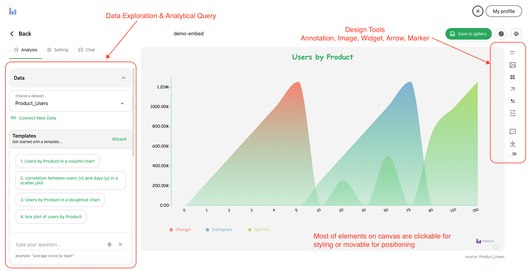
Now, after a few clicks - this is what I got using the sample data mentioned earlier, need more polish or not, it is ready to show up lively in your blog post!

Build Graph

Step-4: Share and embed

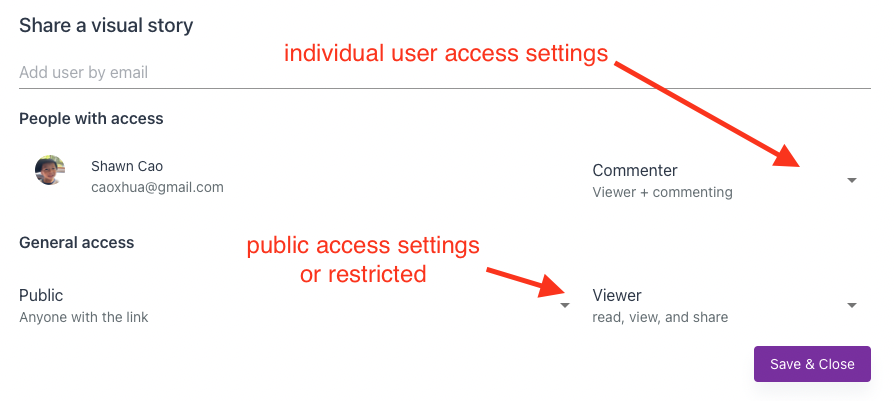
Saving a graph into your gallery only requires a name. Once it’s sitting on your board, you can set any level of visibility of it: Public Visible to list of invitees For blog post purposes, it’s most likely to be public viewable. Once the setting is turned on, we get a unique URL to this visual story. Also, you got an embeddable code that you can copy/paste into your blog post in HTML format.

Share a visual

From the sharing dialog, you can copy the embed code, it will look like this example:

<iframe
src="https://columns.ai/visual/view/jZorEMEoau0dcl?headless"
style="aspect-ratio: 16/9; width:100%;"
frameborder="0"
allowfullscreen />

We have some documentation on sharing and embedding, please refer to this link.

Step-5: Set up a schedule

This is the last step, after we publish and embed a visual story into my blog post, how can I make it automatically updated if my data changes?

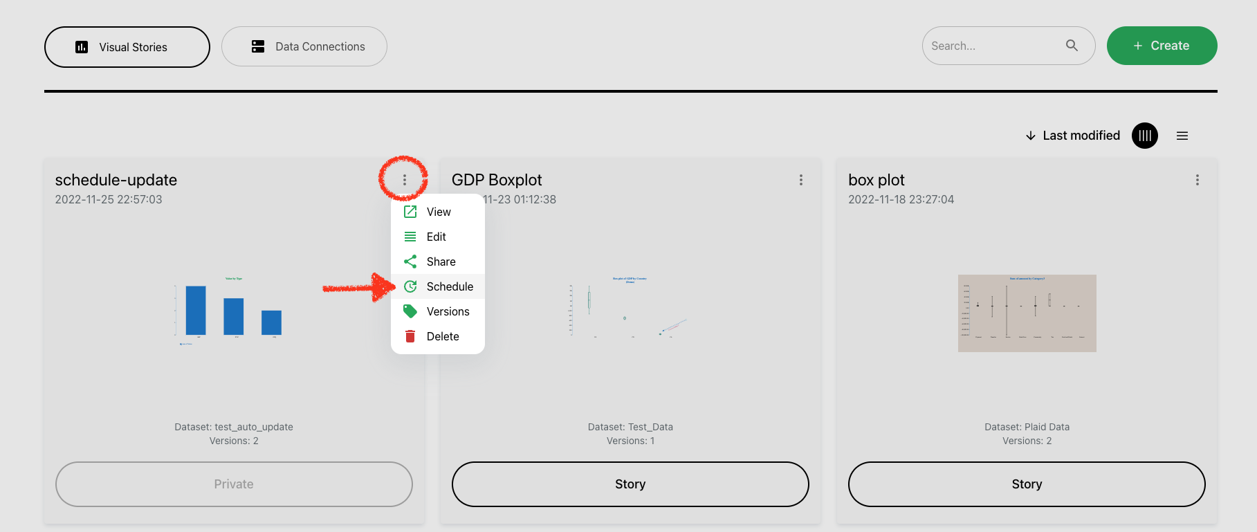
Absolutely, Columns covers that, the only option you need to look at is “Schedule”, from this option, you can set up a scheduler for every individual visual graph, frequency from 1 hour to 30 days, whatever suits your need. We have a doc page on how schedule works.

The only thing you need to do is to just simply update your Google Spreadsheet data and your readers shall see all the fresh live graphs, and you need to do nothing to make this “magic” happen.

Set Schedule

Conclusion

Use data to polish and shine your content writing, using a live graph in your article requires just a little effort. Embed a Columns graph today!

Having any questions? Contact us at support@columns.ai

· 2 min read
Shawn Cao

Live Dashboard Release

Greetings!

Columns is a data storytelling platform, we have continued building storytelling technology for you to do better communication using your data. It is designed to meet these goals, if any of these fails for you, we owe more work to you:

  • Easy to discover and generate visual insights by data analysis.
  • Handy design tools to customize and style a data story.
  • Worry-free sharing with multiple communication methods.

In the last few months, we have received many user requests on building a dashboard. Columns is powered by its own big data computing infrastructure which serves large data set analysis, this distributed system is actually open-sourced, you can find it on GitHub if interested. With the advantage of this infrastructure, we can keep your visual stories in sync with your data.

So today, we introduce you Columns Live Dashboard.

Live Dashboard

First of all, we created a 40s video as an overview, please check it out on Youtube.

On Columns, a dashboard is simply called a page, a simple page that collects and organizes multiple visual graphs together.

The gold part is “LIVE”, now you can flexibly set a “schedule” on any visual story, once set Columns will automatically update the visual story in sync with your data on a schedule.

How to set it up?

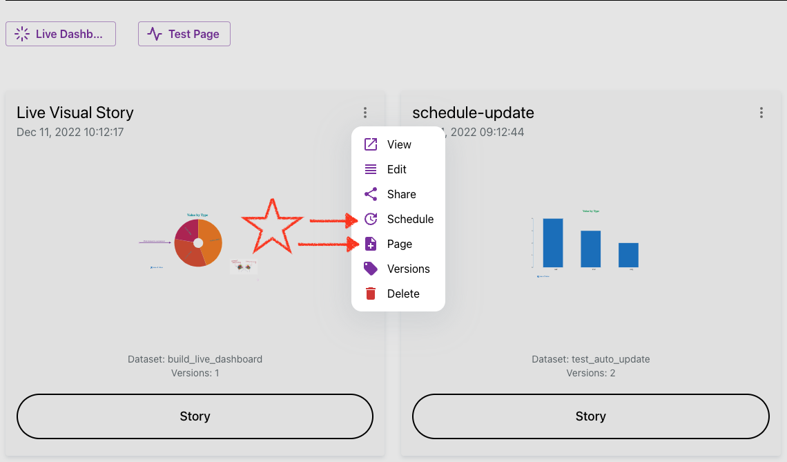
It’s simply just these two options in the visual story menu:

  • Schedule
  • Page

setup-live-page

We hope this is helpful for you as well as those who have asked! Here is the document page for the live dashboard feature.

Again, we love to hear your feedback, by any way listed on the contact page.

· One min read
Shawn Cao

Changes list

Today we only present a single update - but BIG!! 🚀🚀🚀🚀🚀 Scheduler Set a schedule to ask Columns auto-update your data story!

If you're a blogger, or marketer to maintain a web page or site where you want to your data graph to keep up with your spreadsheet, this is convinient way to go!

Check out this simple doc now to turn on schedules for your data stories, cheers!

· One min read
Shawn Cao

Changes list

  1. Add new graph type: Word Cloud
    1. It comes with a wizard where you can choose a single key column to render a word cloud.
    2. You can customize its palette to use different color to display text.
    3. General font settings impacts the word in display unless overwrite by settings.
  2. Improved recommendations for Box plot and Word cloud charts.
  3. Fixed a few typos and docs for Boxplot and Word cloud.

· One min read
Shawn Cao

Changes list

  1. Added a few useful chart types.

    • Tree map - useful for . (found in Tree chart settings)
    • Radar.
    • Boxplot, Dot plot in addition to scatter plot. These are useful for statistics.
    • Big Text: when there is only one number in your query result.
  2. Improved time config in data importing. Timeline function is even more powerful with forecasting.

  3. Support compressed CSV/TSV - these type of files are usually highly compressible. It makes uploading large files much faster and saving lots of storage space.

  4. Better filtering usability - you can easily filter an item from dimension or metric list, also enjoy the auto complete features in fitler editing.

  5. Full tested SSO + team management feature including team workspace.

Upcoming

Columns will bring in a rich text editor where you can easily query and charting your data in a doc. Please get in touch if you are interested in private beta testing.