
Embed a live data story in your blog
As a blog writer, do you dream about embedding a live data graph in your article? It shines your content to be more attractive and makes it much more digestible for your readers, also it makes it more worthwhile for your readers to share with others.
More importantly, what about if the data graph automatically updated, and you don't do anything to get the magic?
For example, current blog embeds a live interactive graph, as shown below (hover mouse over for tooltip):
If this is interesting, please read on…
By the way, prefer watching a video? This video is an explainer of this blog post!
Today, let’s lay out the process of how you can achieve this easily using Columns, you can also follow the 5 simple steps to practice it right away...
Step-1: Find relevant data
Believe it or not, there are tons of data out there await to be analyzed and visualized. When you write about a topic, you need some data points to support it, you either can search open public data or manually create your own data. Public data can usually be found in government departments or various organizations. Data is usually available for download as CSV files.
No matter whether you get data from external sources or manually input it on your own, putting them in a Google Spreadsheet is the best way to have your scenario fully automated.
Step-2: Organize/format data
To get live data to be analyzed as a live graph, you need to keep it as a clean table, a clean table has its first row containing all the column names, and each column has either a text value or number value.
As demo, the data for the above live graph can be found here: Product-Users-Days. From the table, you can see it has each column is named and consistent format of values for each column. Keep it as raw as it is, you don’t need to do any analysis at all, since data analysis and summarization is the job to be done by Columns later.
Step-3: Connect data & Build graph
Connecting a google spreadsheet is very straightforward, you just need to paste your spreadsheet URL or copy its unique ID, and follow the 2 steps connection wizard. Your live connection shall be established on Columns from which you can generate as many beautiful graphs as you want. A simple doc describing the Google Spreadsheet connection can be found here.
Once a data connection is created, you can find it in the data tab of your workspace.
Just to mention, Columns don’t store or copy your data, a live connection is only used to read your data when it needs to be.
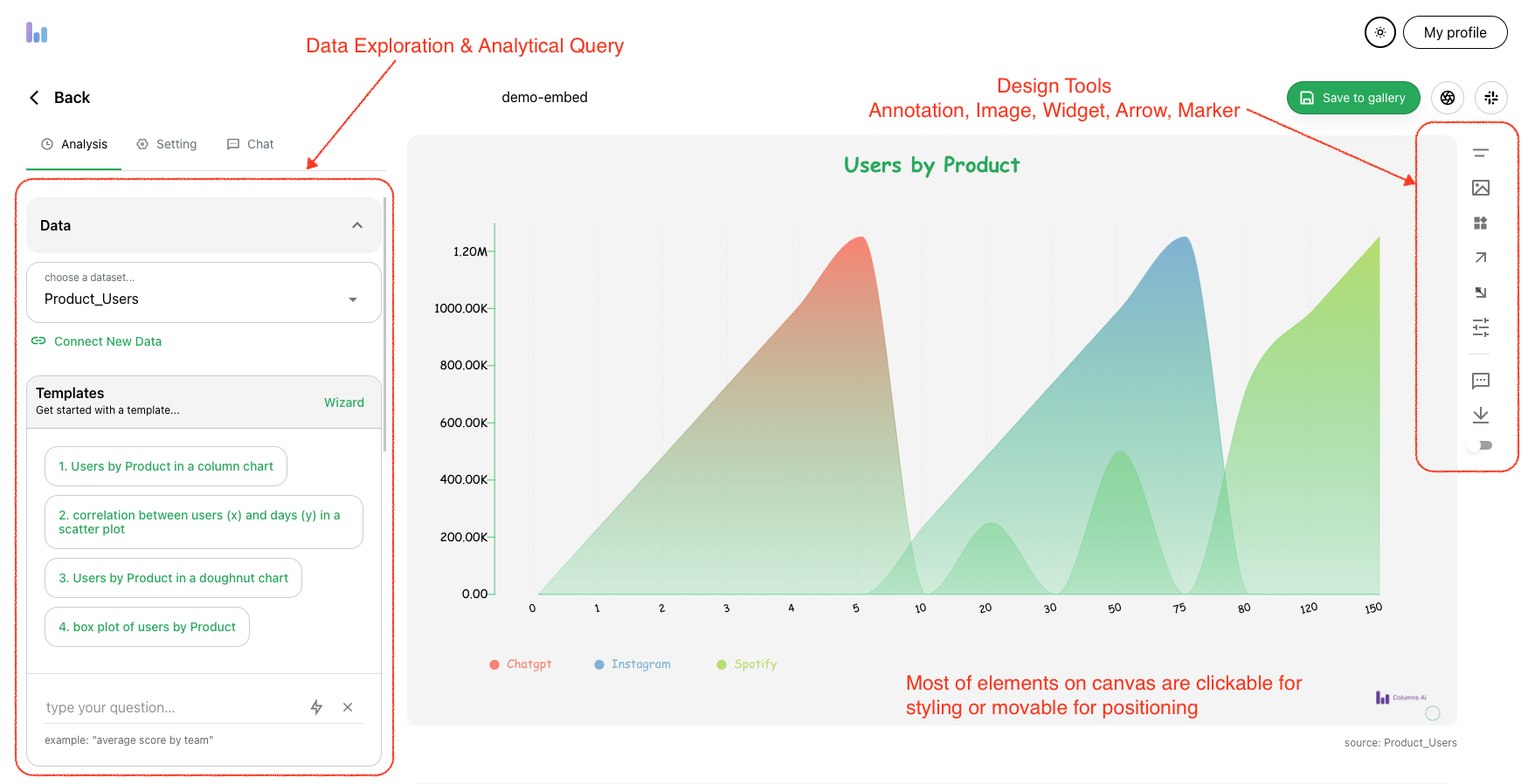
Now, it’s time to build something visually. Just open a new visual creator, and start by choosing the data connection we just created. Upon data selection, Columns loads it in our cloud computing cluster, making it ready for a super fast exploration.
A few things to get you started:
-
Inspect Data: get familiar with your data with a summary of stats, “Inspect Data” gives you the overview of the data you’re working with, including fields and data samples.
-
Quick Queries: Columns generate some quick queries for you to 1-click to start with some graph ideas, after that, you can continue modifying it to get what you want. You also get a “natural language” input box to type a question, Columns try to understand your question based on your data schema and stats.
Now, after a few clicks - this is what I got using the sample data mentioned earlier, need more polish or not, it is ready to show up lively in your blog post!
Step-4: Share and embed
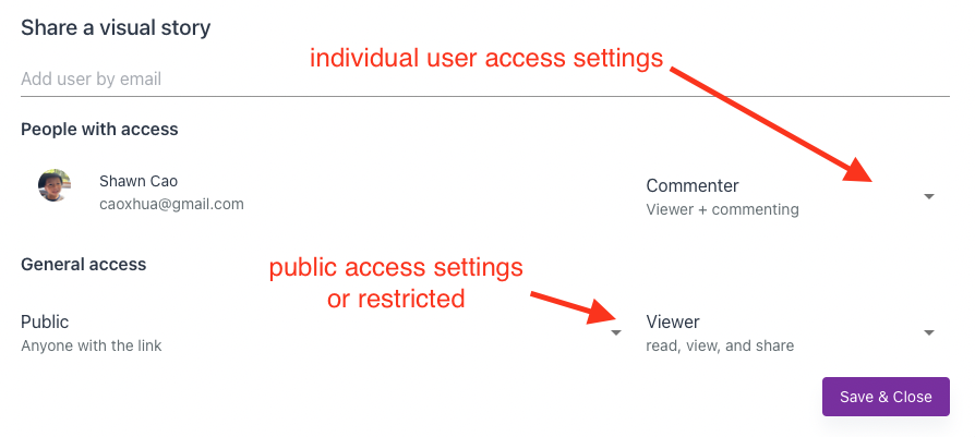
Saving a graph into your gallery only requires a name. Once it’s sitting on your board, you can set any level of visibility of it: Public Visible to list of invitees For blog post purposes, it’s most likely to be public viewable. Once the setting is turned on, we get a unique URL to this visual story. Also, you got an embeddable code that you can copy/paste into your blog post in HTML format.
From the sharing dialog, you can copy the embed code, it will look like this example:
<iframe
  src="https://columns.ai/visual/view/jZorEMEoau0dcl?headless"
  style="aspect-ratio: 16/9; width:100%;"
  frameborder="0"
  allowfullscreen />
We have some documentation on sharing and embedding, please refer to this link.
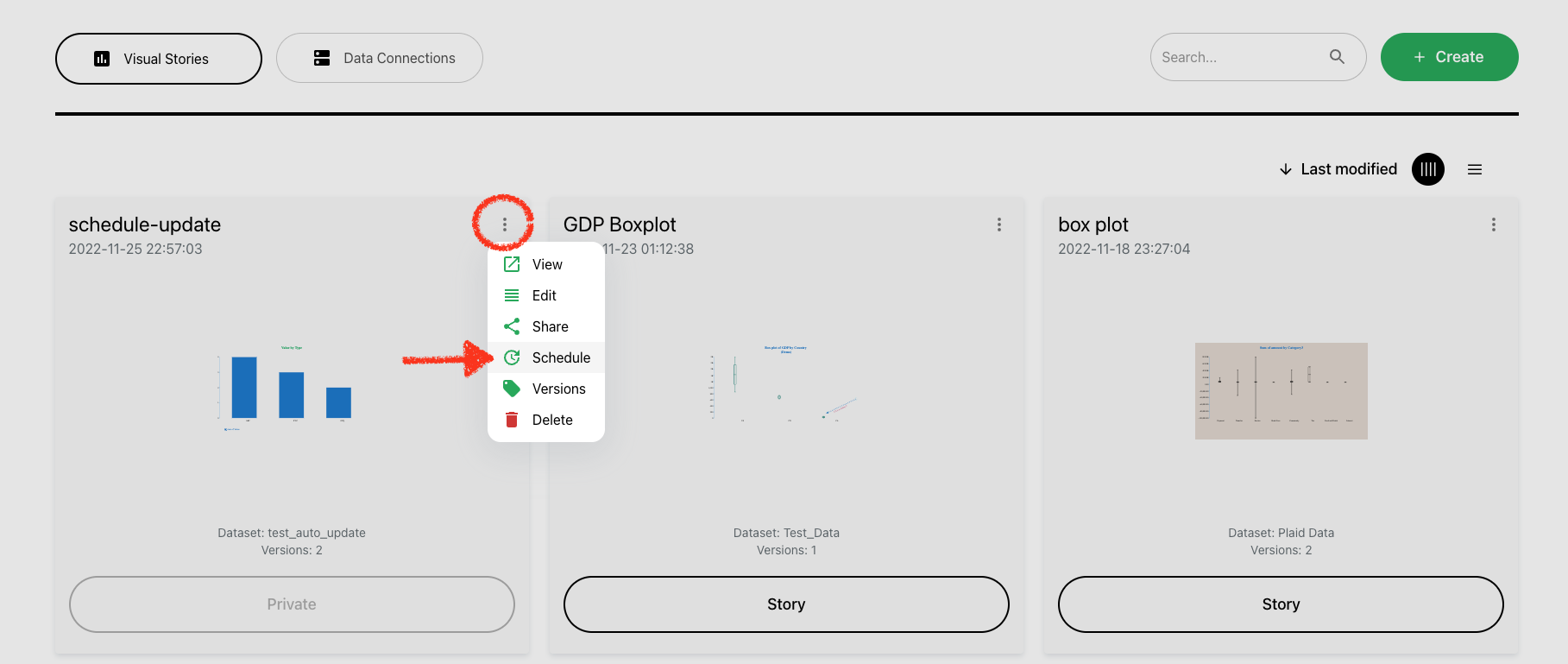
Step-5: Set up a schedule
This is the last step, after we publish and embed a visual story into my blog post, how can I make it automatically updated if my data changes?
Absolutely, Columns covers that, the only option you need to look at is “Schedule”, from this option, you can set up a scheduler for every individual visual graph, frequency from 1 hour to 30 days, whatever suits your need. We have a doc page on how schedule works.
The only thing you need to do is to just simply update your Google Spreadsheet data and your readers shall see all the fresh live graphs, and you need to do nothing to make this “magic” happen.
Conclusion
Use data to polish and shine your content writing, using a live graph in your article requires just a little effort. Embed a Columns graph today!
Having any questions? Contact us at support@columns.ai