

Color Season
The rain has been pouring here for a few days, for Seattle, it means the beginning of the fall. I love Fall, it's the season of colors. In the morning, I feel so content walking with my daughter, on the soft yellow leaves toward the school, before the bell. That's even better if holding a warm cup of coffee, on the other hand.
I keep working on Columns because I want people to find the same beauty in their data.
Alright, here are our updates for September -
Easy to Forecast
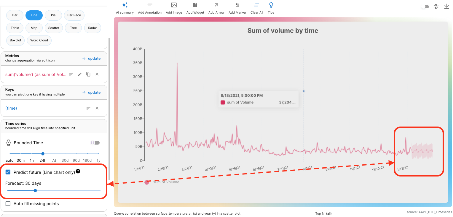
Time series data is the special power of Columns because it's built on top of a super-fast time-series database.
When you connect your data, if supported TIME fields are detected, you can choose one as the time column, check out this doc for supported time values.
As long as your data has a Time column, the Time Range filter will always show up. In addition, there is a special KEY called (time) you can select to represent the time column, meaning all metrics selected will be broken down by TIME. Accordingly, Time Series pane will show up for you to:
- Adjust time window
- Choose the time window type (bounded vs. unbounded)
- Predict future.
Connect a time series data set today, and see how the forecast tells the future of your data!
Consolidated Explore
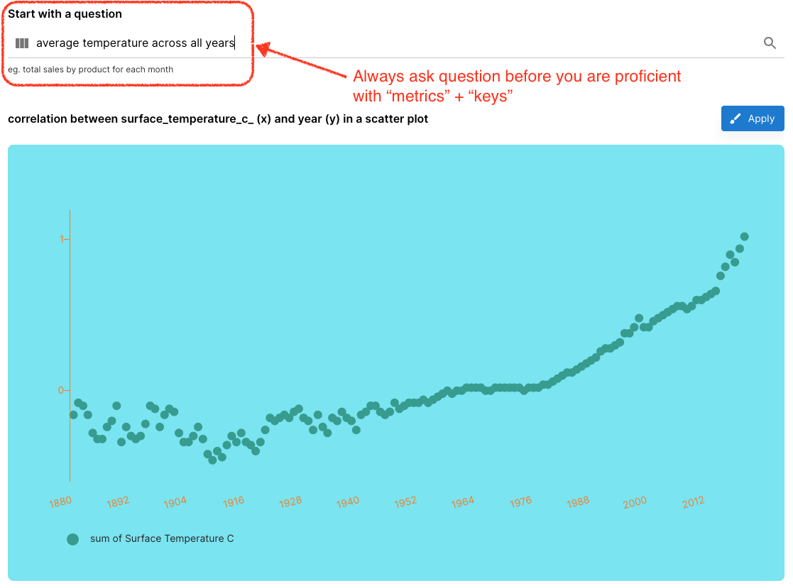
Columns is NOT a simple charting tool, it's designed to analyze your data, the two most important terms in the analysis are
- "Metrics": the value you would like to see
- "Keys": the dimensions you would like to break down the "metrics".
For example, in a query of "average temperature across all years" or "average temperature by years", "temperature" is the Metric, and "year" is the key.
When you get lost, always go to "Explore", simply type your question and AI understands you and translates your question into the query.
In this consolidated view, we also integrated Data Summary below query generation, so you can simply scroll down to view your data stats, data samples, each value distribution for each field, etc.
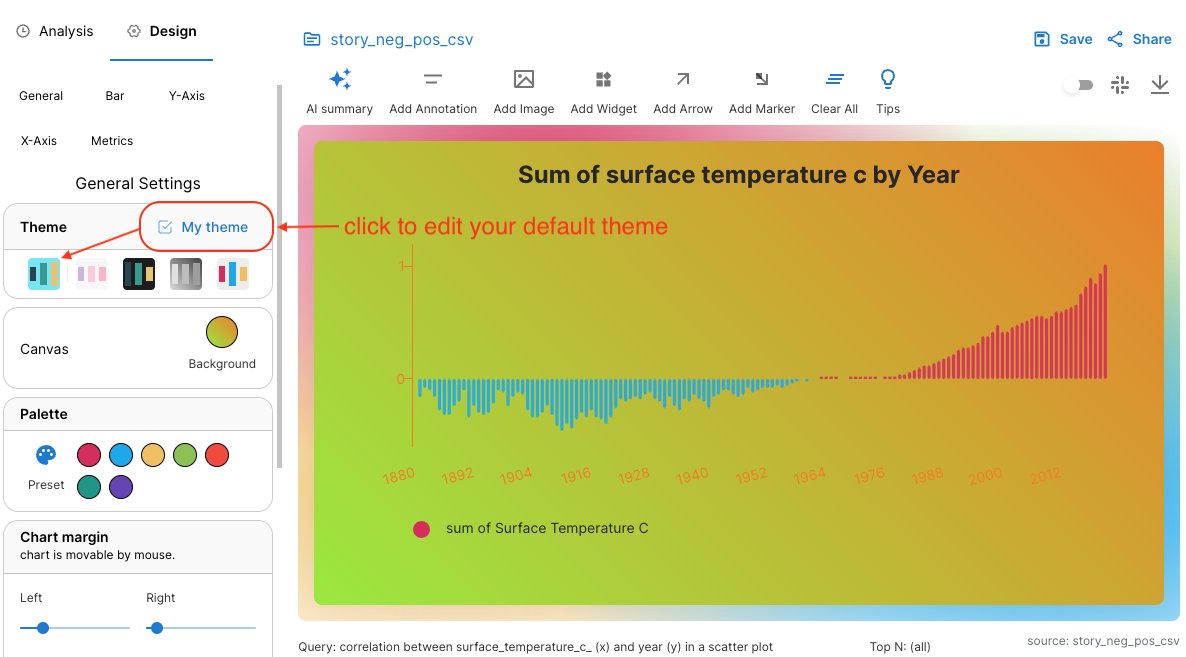
Edit Preference Inline
Preference is the collection of properties that defines your preferred styles: background, palette, logo, font, axis color, etc.
Before you had to go to your Profile page to view and edit those properties, now you can edit them in story building time, any time you want to modify, you can just open and edit.
Window Sizer
The last shortcut to mention - switch window size between standard vs wide. I usually switch to "Standard" when viewing a data story, but use "Wide" in creating time.
That's all for now, see you next time!