
7 posts tagged with "release"

View All Tags

· 2 min read
Shawn Cao

Live Dashboard Release

Greetings!

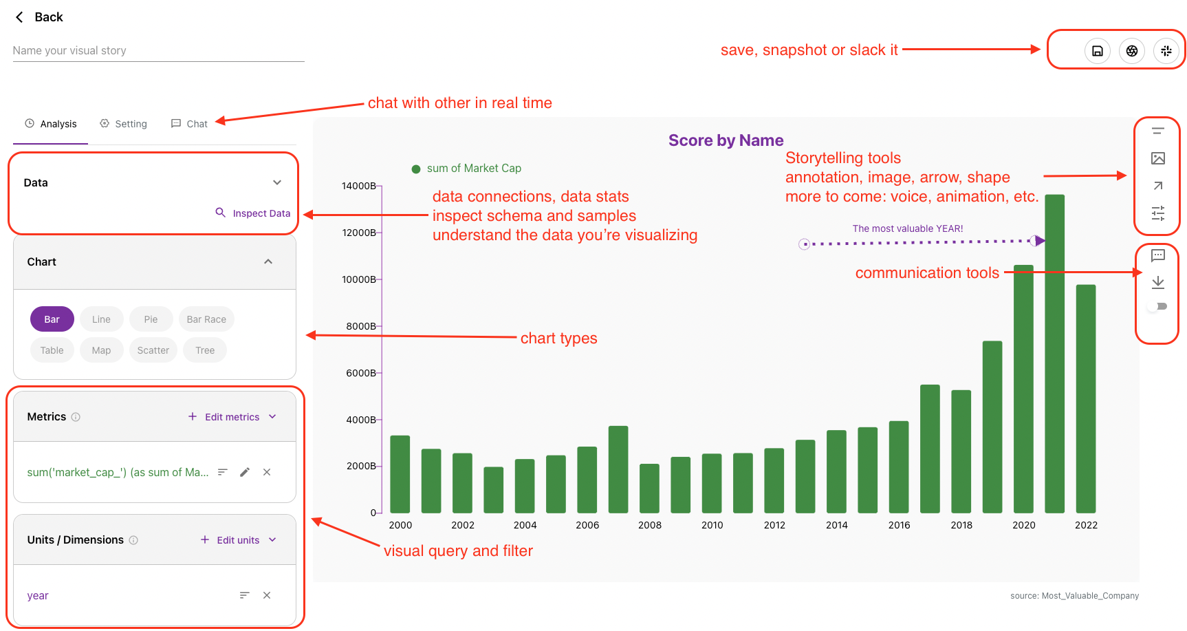
Columns is a data storytelling platform, we have continued building storytelling technology for you to do better communication using your data. It is designed to meet these goals, if any of these fails for you, we owe more work to you:

  • Easy to discover and generate visual insights by data analysis.
  • Handy design tools to customize and style a data story.
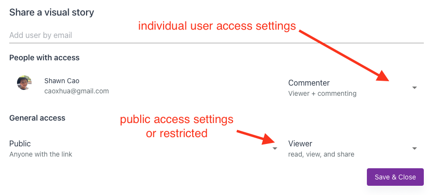
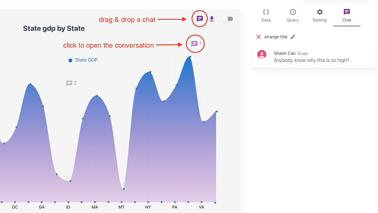
  • Worry-free sharing with multiple communication methods.

In the last few months, we have received many user requests on building a dashboard. Columns is powered by its own big data computing infrastructure which serves large data set analysis, this distributed system is actually open-sourced, you can find it on GitHub if interested. With the advantage of this infrastructure, we can keep your visual stories in sync with your data.

So today, we introduce you Columns Live Dashboard.

Live Dashboard

First of all, we created a 40s video as an overview, please check it out on Youtube.

On Columns, a dashboard is simply called a page, a simple page that collects and organizes multiple visual graphs together.

The gold part is “LIVE”, now you can flexibly set a “schedule” on any visual story, once set Columns will automatically update the visual story in sync with your data on a schedule.
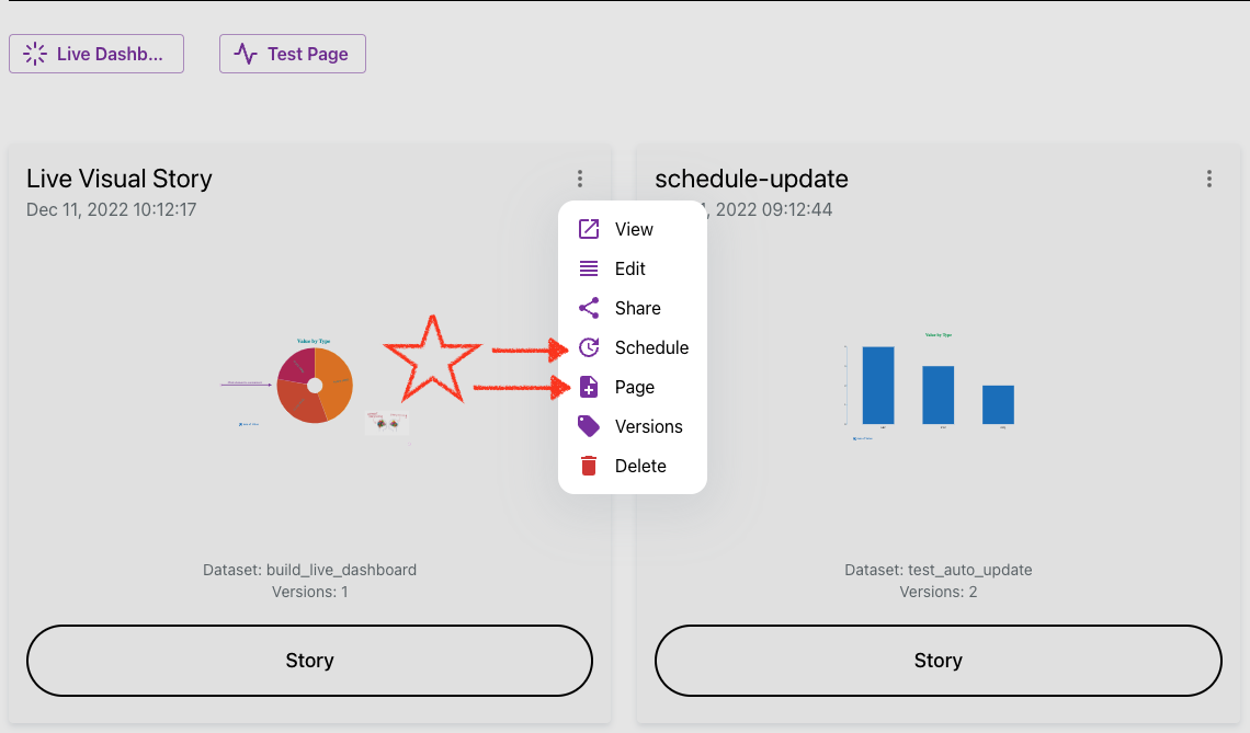
How to set it up?

It’s simply just these two options in the visual story menu:

  • Schedule
  • Page

setup-live-page

We hope this is helpful for you as well as those who have asked! Here is the document page for the live dashboard feature.

Again, we love to hear your feedback, by any way listed on the contact page.

· One min read
Shawn Cao

Changes list

Today we only present a single update - but BIG!! 🚀🚀🚀🚀🚀 Scheduler Set a schedule to ask Columns auto-update your data story!

If you're a blogger, or marketer to maintain a web page or site where you want to your data graph to keep up with your spreadsheet, this is convinient way to go!

Check out this simple doc now to turn on schedules for your data stories, cheers!

· One min read
Shawn Cao

Changes list

  1. Add new graph type: Word Cloud
    1. It comes with a wizard where you can choose a single key column to render a word cloud.
    2. You can customize its palette to use different color to display text.
    3. General font settings impacts the word in display unless overwrite by settings.
  2. Improved recommendations for Box plot and Word cloud charts.
  3. Fixed a few typos and docs for Boxplot and Word cloud.

· One min read
Shawn Cao

Changes list

  1. Added a few useful chart types.

    • Tree map - useful for . (found in Tree chart settings)
    • Radar.
    • Boxplot, Dot plot in addition to scatter plot. These are useful for statistics.
    • Big Text: when there is only one number in your query result.
  2. Improved time config in data importing. Timeline function is even more powerful with forecasting.

  3. Support compressed CSV/TSV - these type of files are usually highly compressible. It makes uploading large files much faster and saving lots of storage space.

  4. Better filtering usability - you can easily filter an item from dimension or metric list, also enjoy the auto complete features in fitler editing.

  5. Full tested SSO + team management feature including team workspace.

Upcoming

Columns will bring in a rich text editor where you can easily query and charting your data in a doc. Please get in touch if you are interested in private beta testing.

· One min read
Shawn Cao

Changes list

  1. Completely new visual story workspace

    • Work with multiple different data sources in one visual story.
    • Save mulitple versions in one edit.
    • Brand new data source exploration, get all information about the data you're working on.
    • Get query recommendations from your data without knowning how to analyze it.
  2. Support general chat for each visual story and drop-in-place chats in graph anywhere.

  3. Fine grained access control of your visual story

    • Share with specific individuals (by emails), they will get email notifications.
    • Share with public/everyone with different permission level (viewer, commenter, editor).
  4. Other improvements, such as

    • Support "percentage" format in value format options.
    • Support frame fine tuning bar race experience by introduce frame steps setting.
    • Other UI updates.

Examples

  1. Check out our new visual story composer Visual Story

  2. Share with people. Access Settings

  3. Chat with people freely Drop chats

· One min read
Shawn Cao

Changes list

  1. Improve usability of Tooltip - always place tooltip on the top over other visual elements.
  2. Revamp on Bar Race, easy to create fully customized bar race chart.
  3. Introduce entity repo to allow Columns to look up entity info by key (Entity examples: company, country).
  4. Support different shape choices for arrow - Triangle or Circle.
  5. When data expired in Columns Cloud during creation time, Columns now automatically reload it so users don't need to refresh the page.

Examples

  1. 1-minute to create a bar race chart. Bar Race Chart Example

  2. Maintain a legit entity repo. (https://columns.ai/entity) Entity example

· One min read
Shawn Cao

Changes list

  1. Enhanced Line/Area chart to enable style settings for every single line (metric).
  2. More reliable settings of appropriate number of axis tick count.
  3. Limit breakdowns from freezing web UI when there is a huge breakdowns in pivoting case.
  4. Bug fixes - such as sorting state loss, value precision can not set to 0.

Examples

  1. set different style for each line including line width, and marker style Each metric line has its own style